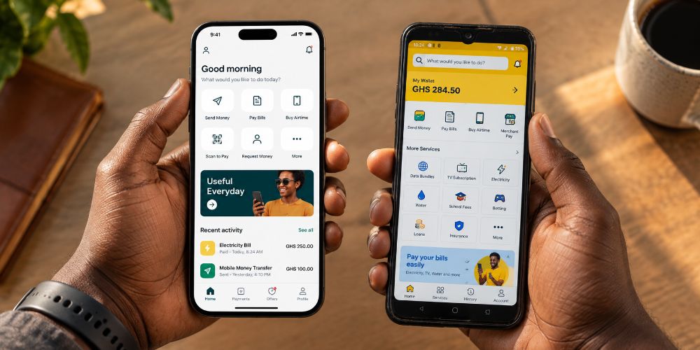
Every few months a new list appears.
The top UI trends of the year. The design patterns worth paying attention to. The shifts happening in real products right now. They are written by talented designers working on products used by millions of people in cities with fast internet, flagship phones, and users who have been navigating digital interfaces since before they could drive.
I read them. I find them useful. And then I sit with my team and we ask the question that those articles never answer.
What does this actually mean for our user?
Not the user in the trend report. Our user.
- The chop bar owner in Tema who checks her dashboard between the lunch rush and the dinner prep.
- The provisions store manager in Kumasi who is on his third Android phone this year because the first two got damaged.
- The market trader whose data runs out on the twenty third of every month and who is navigating your product on Edge network until payday.
That user is not who these trends were designed for. And the gap between who the trend assumes and who is actually on the other end of your product is where most African digital products quietly fall apart.
Functional minimalism sounds right. It is not always right for our context.

The argument for functional minimalism is compelling. Remove the noise. Reduce unnecessary decisions. Show only what matters and let the user move. Less clutter, faster comprehension, cleaner outcomes.
For a user who has been navigating digital products for a decade, this works beautifully. They have internalized the conventions. They know that the hamburger icon means menu. They know that a greyed out button means unavailable. They read visual hierarchy instinctively because they have seen it ten thousand times.
For a first generation smartphone user navigating a financial product for the first time, functional minimalism can become functional invisibility. The affordances that seem obvious to a design team in a studio are not obvious to someone who has never encountered them before. They need more cues, not fewer. More labels, not less text. More visual guidance, not cleaner white space.
The trend is right that removing unnecessary noise matters. But the definition of necessary is entirely dependent on your user. What is noise for one person is a lifeline for another.
I learned this the hard way rebuilding a sign up flow. What looked clean and minimal to me in testing looked empty and confusing to merchants who were encountering digital onboarding for the first time. The trend pointed me in a direction. The users told me where to stop.
Real time feedback is the one trend that translates perfectly. And most African products are still ignoring it.
When a user does something, tell them immediately what happened. A form submission, a payment, a search, an upload. Do not make them wonder. Do not make them tap twice to check. Tell them in real time, clearly, that their action was received and what happens next.
This is not a new idea. But it is one that global products have implemented consistently and that many African digital products still treat as optional.
The stakes are higher here than the trend reports acknowledge. When a merchant processes a payment and the screen does not respond immediately, they do not think there is a delay. They think something went wrong. They tap again. The transaction doubles. They panic. They call customer support. The trust that took months to build takes thirty seconds to lose.
Real time feedback is not a UX nicety in our context. It is a trust mechanism. Every moment of uncertainty in a financial product is a moment where the user is deciding whether to keep going or to walk away. Eliminate the uncertainty and you eliminate the hesitation.
This is the trend worth investing in most aggressively. Not because it is fashionable but because the cost of ignoring it is paid in real merchant trust every single day.
AI as a layer, not a feature. Right idea. Wrong starting point for our market.
The global conversation around AI in UI is moving in an interesting direction. The argument is that AI should be invisible. It should work behind the interface, personalising, predicting, simplifying, without announcing itself at every step. Not an AI button. Not a chatbot in the corner. Just a product that gets smarter about you over time without making you think about how.
This is genuinely good design thinking. And it will eventually be the right approach for African digital products too.
But there is a step that needs to happen first. Trust.
In many parts of Ghana and across the continent, AI carries a weight of suspicion that Western markets have largely moved past. Users want to know what the system is doing with their data. They want to understand why a recommendation appeared. They want the option to say no. An invisible AI layer that personalises without explaining itself can feel, to a user who already has limited trust in digital financial products, like something is happening to them rather than for them.
The trend is right about the destination. The journey requires a different starting point in our market. Transparency before invisibility. Explained before assumed. Trust earned before convenience delivered.
Design systems and tokens. Necessary. Most African product teams are not there yet.
The global conversation around design tokens and systematic approaches to UI is mature and well developed. Consistent type scales, colour systems, spacing grids, component libraries. These are the invisible infrastructure of products that feel coherent and professional across every screen and every state.
Most African product teams are still in the phase of making individual decisions about individual screens. Not because they lack the talent. Because they lack the time, the tooling, and sometimes the organisational buy in to step back from shipping features long enough to build the system underneath them.
The cost of this is felt slowly. A button that is slightly different shade of green on three different screens. A form that behaves differently on the payment page than it does on the sign up page. A product that works but never quite feels finished. Users cannot always name what is wrong. They just feel it. And that feeling, of a product that was assembled rather than designed, erodes the confidence that financial products particularly need to earn.
This is the investment that feels least urgent and matters most in the long run. Not because the trend says so. Because coherence is a form of trust. And trust, in the African fintech space, is the product.
What survives the translation and what does not.
Functional minimalism survives but needs local calibration. Real time feedback survives and should be prioritised above almost everything else. AI as a layer is coming but needs a trust foundation to land on first. Design systems survive and should be built now even though it feels early.
What does not survive is the assumption that your user is the same user the trend was designed for. They are not. And building products that pretend otherwise is one of the most expensive mistakes an African digital product team can make.
The trends are written for a particular context. The work is understanding which parts of them travel and which parts need to be rebuilt from the ground up for the user actually on the other end of your product.
That translation is not a limitation. It is the most interesting design problem in the world right now.
And it is ours to solve.